
China Kraft Paper Box Solutions for Sustainable Brand Packaging
2026-10-09
Every brand wants packaging that speaks sustainability without saying a word. For companies navigating the shift to eco-conscious materials, kraft paper boxes have become more than a trend—they're a quiet statement of intent. Yet sourcing reliable, high-quality solutions in China often feels like a maze. That's where Kuaijie Carton steps in, turning sustainable packaging from a challenge into a clear advantage. Here's how their kraft paper box solutions help your brand carry its values from warehouse to doorstep.
What Makes Chinese Kraft Board Different From Generic Recycled Paper
The difference starts with fiber selection. Chinese kraft board mills commonly pull from a narrower furnish stream than generic recycled paper plants, which accept mixed office waste, old corrugated containers, and even newsprint. By keeping the incoming fiber cleaner and longer, the resulting board retains more of the natural interlocking strength that short, over-processed fibers lose.
Process control also separates the two. Chinese kraft lines typically run with tighter refining curves and more aggressive screening to remove fines and stickies before the sheet forms. That means fewer weak spots, better surface smoothness, and more consistent caliper across a reel. Generic recycled paper, by contrast, often has to compensate for variable feedstock with heavier chemical treatment, which can leave the sheet brittle.
You notice it most in converting and printing. Chinese kraft board tends to hold a crease cleanly without cracking because the fiber network is more uniform. It also takes starch-based adhesives and water-based inks without excessive curling, something generic recycled stock struggles with when the furnish shifts between batches.
Customizing Kraft Boxes Without Losing the Raw, Natural Feel
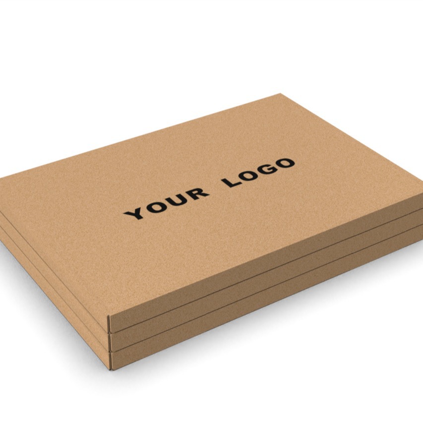
Kraft boxes carry an understated charm that comes from their unbleached fibers and muted brown tones. Customizing them doesn't have to mean covering every inch with loud graphics. Start by letting the board itself breathe—use single-color prints, blind debossing, or subtle foil accents that sit quietly on the surface. A thin, hand-drawn line illustration or a small logo placed off-center can add identity without shouting over the material's natural texture.
Color choices play a bigger role than coverage. Instead of full-bleed backgrounds, pick earthy inks like deep charcoal, olive, or terracotta, which blend with the kraft base rather than fighting it. If you need more information on the box, consider a simple sticker or a stamped label using water-based ink—these details feel tactile and intentional. The goal is to treat the kraft surface as part of the design, not just a blank canvas to be hidden.
How Flat-Packed Kraft Boxes Cut Shipping Costs and Carbon Footprint
Shipping a box that is mostly air has always been a quiet drain on logistics budgets. Flat-packed kraft boxes change that math by arriving as compact, stackable sheets that unfold into sturdy containers only when needed. A pallet that once held 200 pre-assembled cartons can easily carry 1,500 flat versions, which means fewer trucks, fewer trips, and a much lower fuel bill per unit shipped.
The savings go beyond diesel. Because these boxes are made from lightweight kraft board and lie nearly flat, warehouses can store more inventory in the same square footage, reducing the need for off-site overflow storage. Every cubic meter saved in a container or delivery van directly cuts the carbon emitted per order, without asking customers to sacrifice protection or presentation.
There is also a subtle efficiency at the packing station. Workers spend less time folding and taping pre-erected boxes, and the flat format works well with automated packing lines. Fewer damaged edges during transit mean fewer replacements and returns, which quietly removes another layer of waste and emissions from the supply chain.
Why Minimalist Brands Are Choosing Brown Kraft for Modern Visual Identity
The shift toward brown kraft in minimalist branding isn't just about aesthetics—it's a tactile rebellion against the cold sheen of digital perfection. Where glossy finishes and stark white stock once signaled premium, today's pared-down labels lean into kraft's raw, unbleached texture as a deliberate anchor to the physical world. This choice lets a brand feel grounded and unpretentious, offering consumers a moment of sensory pause in an otherwise screen-saturated experience.
Beyond touch, the muted, earthy tone of kraft carries a quiet honesty that aligns with the values modern minimalists hold close. It whispers sustainability, not through loud certifications or greenwashed claims, but through the simple act of showing material as it is—imperfect fibers, subtle flecks, and all. For a generation that reads visual cues before fine print, brown kraft communicates a kind of handmade integrity that polished alternatives often fail to convey.
What makes kraft truly compelling for minimalist visual identity is its chameleon-like ability to disappear into the background while still defining the foreground. Paired with restrained typography and generous white space, kraft becomes less a color and more a context—a neutral stage that lets a single logo or wordmark carry the entire narrative. This flexibility means a kraft-based system can stretch across packaging, stationery, and digital touchpoints without ever feeling repetitive or forced, proving that understatement can be its own form of distinction.
The Second Life of a Kraft Box Through Composting, Reuse, and Circular Design
A kraft box rarely gets a proper farewell. Most end up crushed in a recycling bin, their fibers destined for a downgraded afterlife. But when you look closer, that unassuming brown carton holds far more potential than a single trip from warehouse to doorstep. Composting is the quiet hero here—strip away any plastic tape or labels, tear the box into strips, and let moisture and microbes do the rest. Within weeks, the corrugated layers break down into dark, crumbly humus that feeds garden beds instead of languishing in a landfill. The key is starting with unbleached, uncoated kraft, because glossy finishes and synthetic adhesives simply refuse to rot.
Reuse takes a more hands-on route. Before a box ever meets the compost pile, it can serve a dozen smaller purposes: a drawer organizer, a weed-blocking sheet under mulch, a makeshift canvas for kids’ paintings, or even a sturdy base for a DIY cat scratcher. Because kraft board is rigid yet easy to cut, it transforms with nothing more than scissors and a bit of tape—though if you want to keep the circle truly closed, swap the plastic tape for paper tape or twine. Each reuse delays the box’s final breakdown and saves the energy that would have gone into producing a new container.
Circular design pushes the idea further: what if the box was engineered from the start to live many lives? Some companies now print shipping labels directly onto unbleached kraft, eliminating the plastic pouch that usually gets peeled off and thrown away. Others embed seeds in the cardboard fibers, so after the box’s last delivery, you can plant it and watch wildflowers sprout. The real shift comes from treating kraft not as disposable packaging but as a material in motion—compostable when clean, reusable when intact, and always designed to return to the soil without a trace of synthetic guilt.
Designing Unboxing Moments Around Sustainable Materials That Speak Softly
The first thing you notice is the absence of gloss. A box made from unbleached, recycled fiber sits in your hands with a slight tooth, almost like heavy watercolor paper. Instead of a plastic tear strip, a single strand of cotton twine wraps around the lid. Lifting it off feels deliberate, unhurried. The materials don’t shout for attention; they invite a slower kind of curiosity.
Inside, the cushioning might be molded mushroom fiber or crinkled kraft that has already lived another life as a shipping envelope. A small card, printed with soy-based ink in one muted tone, tells you the box can be recycled or composted without separating layers. There is no glossy logo slapped across the front, only a tiny embossed mark near the corner. That restraint gives the textures room to speak: the soft ridges of paper pulp, the faint fibrous edge of a cotton tie, the weight of a lid that settles without a plastic snap.
By the time you reach the actual product, the unboxing has become more like unfolding a letter than tearing into a parcel. The object rests in a precisely molded cradle, not wrapped in layers of film. Whatever scent lingers is faint—dry paper, a hint of cedar shaving. Nothing rattles, nothing crinkles. The whole thing can return to the earth quietly, but the moment it created tends to stay with you a little longer.
FAQ
They can be, if you choose the right board grade and construction. Many suppliers offer double-wall corrugated bases paired with a smooth kraft outer layer, which gives enough rigidity for heavier items like candles, skincare sets, or electronics. Ask for samples with the exact flute type and paper weight you plan to use before committing.
You can stick to water-based coatings, debossing, foil stamping with recyclable foils, or simple one- or two-color flexo printing. Avoid plastic lamination if recyclability matters. Some mills also offer barrier coatings made from plant-based materials, which keep the box recyclable while adding grease or moisture resistance.
Most factories work from your dieline or can develop one from scratch based on product dimensions. Insert trays are usually made from the same kraft board or molded pulp, and they can be cut to hold bottles, jars, or small accessories. Just be clear about the product weight and fragility so they can suggest the right board thickness and buffer space.
It varies, but many suppliers accept 500 to 1,000 units for standard custom boxes if you use existing knife molds. Lower quantities are possible with digital printing or by choosing a stock size and adding custom labels. Expect a higher per-unit cost below 1,000 units, and ask if the factory can store your die for future reorders.
Request the mill's chain-of-custody certificate, usually FSC or PEFC. You can also ask for the percentage of recycled content and whether the mill uses chlorine-free bleaching. A reliable supplier will share documentation without hesitation. If they only say "eco-friendly" with no paperwork, treat that as a red flag.
Standard kraft paper will absorb moisture, so for oily or wet items you need a barrier. Options include a plant-based PLA coating, a water-based grease-resistant layer, or an inner liner made from PE-free coated paper. Test the box with your actual product for at least 48 hours to check for staining or softening.
After artwork approval, expect about 15 to 25 days for production, plus shipping time. Sea freight to North America or Europe typically adds 25 to 40 days, while air freight is faster but expensive for bulky boxes. Always build in buffer time for pre-production samples and potential customs delays.
Some suppliers waive die-cutting or printing plate fees for first-time buyers if you place a minimum quantity, while others roll the cost into the unit price. You can also ask if they have existing dies close to your needed size. If they insist on a separate tooling fee, confirm whether the die remains your property and can be reused without an extra charge later.
Conclusion
Chinese kraft board earns its place in sustainable packaging not by being recycled alone, but by how it is pulped, pressed, and finished. Most generic recycled paper relies on heavy bleaching and synthetic binders to look uniform; Chinese kraft, especially from mills that work with long-fiber virgin pulp mixed with post-consumer waste, keeps a dense, toothy surface that folds cleanly without cracking. That matters when a brand wants a box that still feels raw and uncoated. Customizing these boxes with simple debossing, water-based inks, or a single-color flexo print does not bury the material. A light touch lets the brown fibers show through, which is exactly what many minimalist labels want. Flat-packed design adds another practical layer: boxes ship collapsed, take up less space in a container, and reduce both freight cost and emissions before they ever reach a consumer.
Beyond the first use, kraft boxes from China can be designed for a quieter second life. Because the board is often unbleached and low in plastic coatings, it breaks down in home compost or can be reused as storage without looking disposable. Brands that lean into this circular approach treat the unboxing as part of the product story—no glossy lamination, no metallic foil, just a soft-touch surface and a neatly tucked flap that opens without tearing. The result is a package that does not shout for attention but still feels intentional. For companies building a modern identity around restraint and responsibility, Chinese kraft solutions offer a way to align material choices with the values printed nowhere on the box itself.
Contact Us
Contact Person: Tan Xiang
Email: [email protected]
Tel/WhatsApp: 8613798906863
Website: https://www.dgkjzx.com